
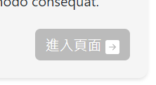
在寫網頁的時候發現 icon 的位置和 demo 的不一樣,看起偏下,如下圖。
目錄
問題敘述
可以發現圖片的位置好像比文字下面。 我是使用bootstrap,所以這個icon的css是bootstrap寫的。 我們可以看bootstrap是怎麼寫的。
問題原因
逮到你囉,老兄
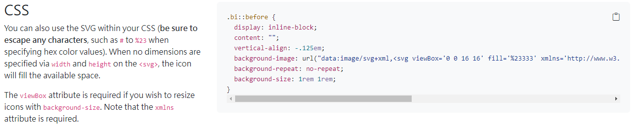
bootstarp 是這樣定義.bi的
.bi::before {
  display: inline-block;
  content: "";
  vertical-align: -.125em;
  background-image: url("data:image/svg+xml,");
  background-repeat: no-repeat;
  background-size: 1rem 1rem;
}
其中 vertical-align: -.125em;就是導致icon看起來偏下的原因,不過也要幫bootstrap講一下話。其實他這樣設計在英文介面是沒有問題的。主要是因為中英文文字的差異讓英文版面的設定在中文看起來偏下。
解決問題
所以如果要解決這個問題,我們可以藉由重新定義.bi的vertical-align。
如果你不知道甚麼是
vertical-align以及單位em的話,你可以參考下面兩篇教學。vertical-alignem
要怎麼求他應該的偏移量呢?
因為我希望他可以是配各種字體大小,所以我偏移量都會用em來處理。
我們可以看下圖
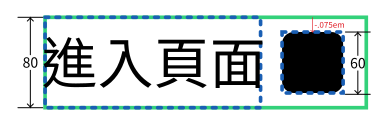
綠色部分是按鈕的內部空間,藍色虛線是這個元素的大小。
我先將文字大小設為60px,但可以發現雖然icon的大小變成了60px(1em),可是文字區塊的span卻是80px,所以整個空間的高度是80px(1.3em)。
所以icon的偏移量應為字體大小的 60/80 = 75%
所以vertical-align設為-.075em
不同場景可能數字不一樣,但可以用類似的作法處裡。